

Components use design tokens only, and every story is checked by the automated accessibility audit (WCAG 2.2 AA).
AiContent
Render the required.ai markup contract with named source, body, citations, and actions.
Open AiContent in Storybook
Tutor hint (chat)

Co-author reply (chat)

Summary (note)

Drafted block (not yet reviewed)
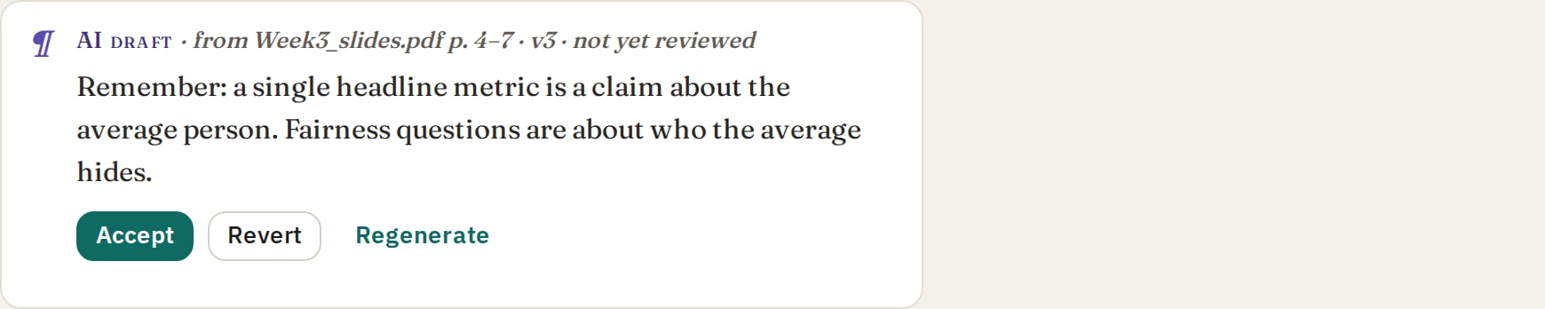
Kept block (reviewed)

Button
Trigger primary, secondary, text, or icon actions. Open Button in StorybookPrimary

Secondary

Text

Disabled

With Icon

Icon Only

As Link

Learner Density

Compact Density

Card
Provide a reusable surface for grouped content. Open Card in StorybookDefault

Quiet

Interactive

Learner Density

Compact Density

StatusChip
Label urgency, mode, stage, or status in a compact line. Open StatusChip in StorybookNeutral

Accent

Ai

Success

Warning

Error

With Icon
